Thackray Gin:
Branding and packaging design for a new craft gin.
Approach
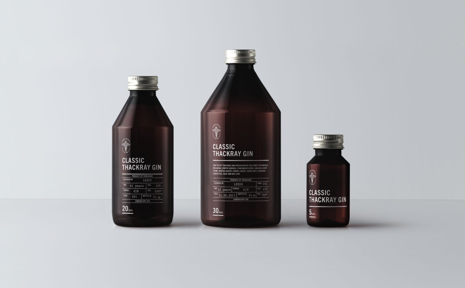
Thackray Gin is a conceptual brand created by Rhubarb Design House. Named after the Leeds-born Charles Thackray who opened a small family-run chemist shop in 1902, the gin brand encapsulates the style of the 1920s. The ‘roaring twenties’ as they were known, were renowned as an age of dramatic social and political change.
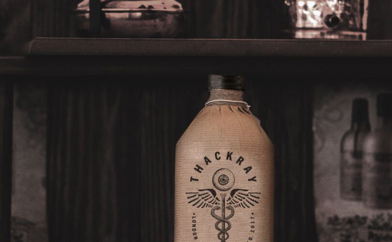
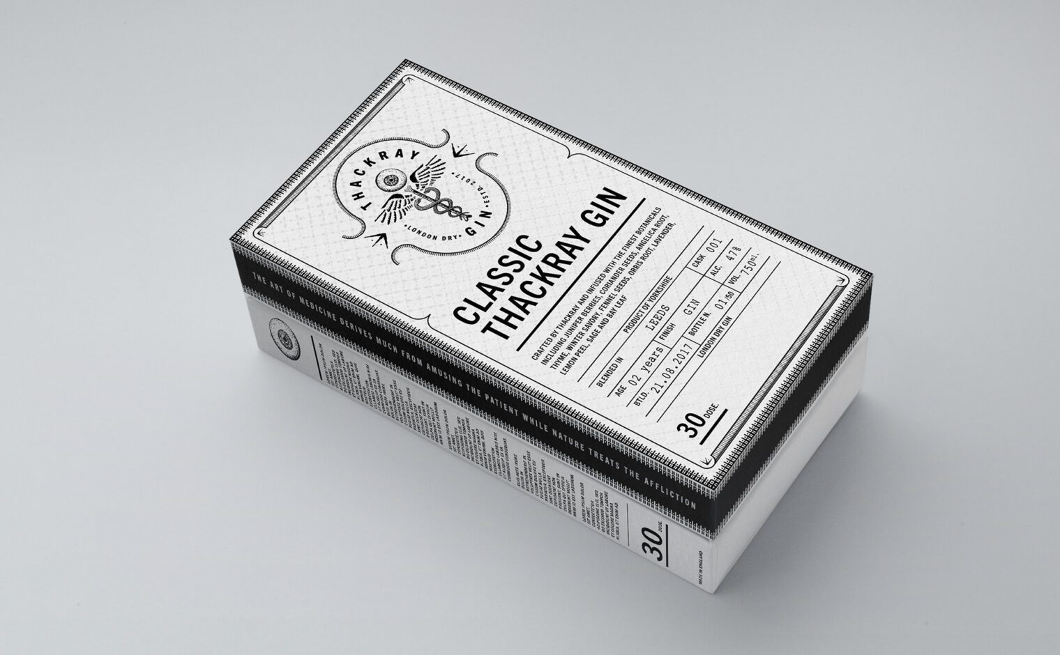
The logo is inspired by the ancient symbol for medicine – the Caduceus – which features two snakes winding around a winged staff. This symbol has been evolved; the staff has been replaced with a bone, whilst an eyeball now sits atop the symbol, giving a whimsical twist to a well-established emblem. The resulting brand mark is an intricately detailed and illustrative symbol which retains an irreverently medical appearance.
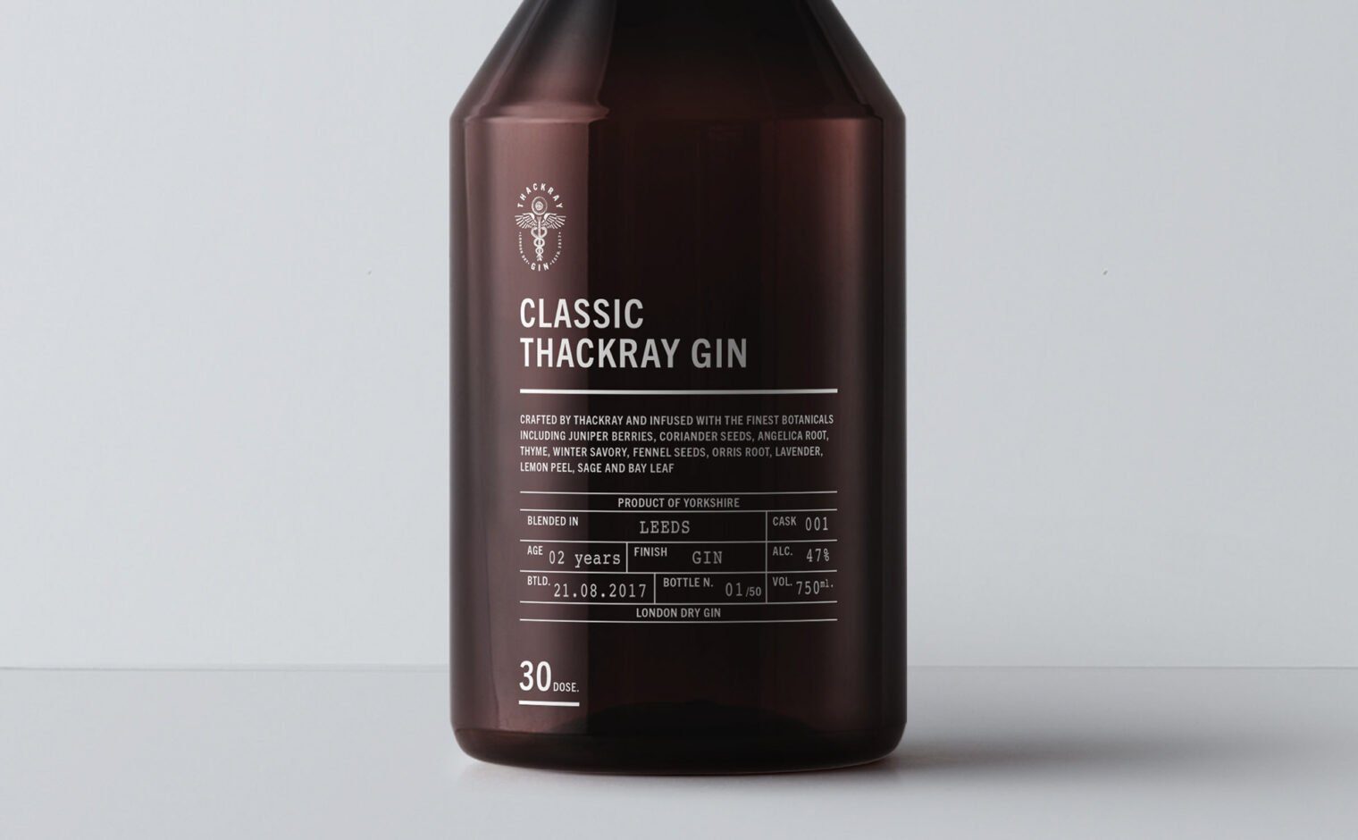
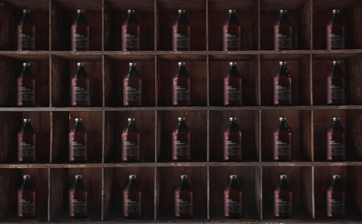
The branding elements combine the contemporary with the traditional, connecting with the past and inviting the drinker to imagine they are visiting a bygone era. The packaging references historical aesthetics, including early medicine bottles and label designs of that era. The simple colour palette reinforces the classic feel of the branding.
Additional elements include a prescription-style gin breakdown sheet, which displays tasting notes and batch details. and an intricately detailed presentation box.
