Long Division:
Brand evolution for a city-wide music and culture festival celebrating its tenth year.
Approach
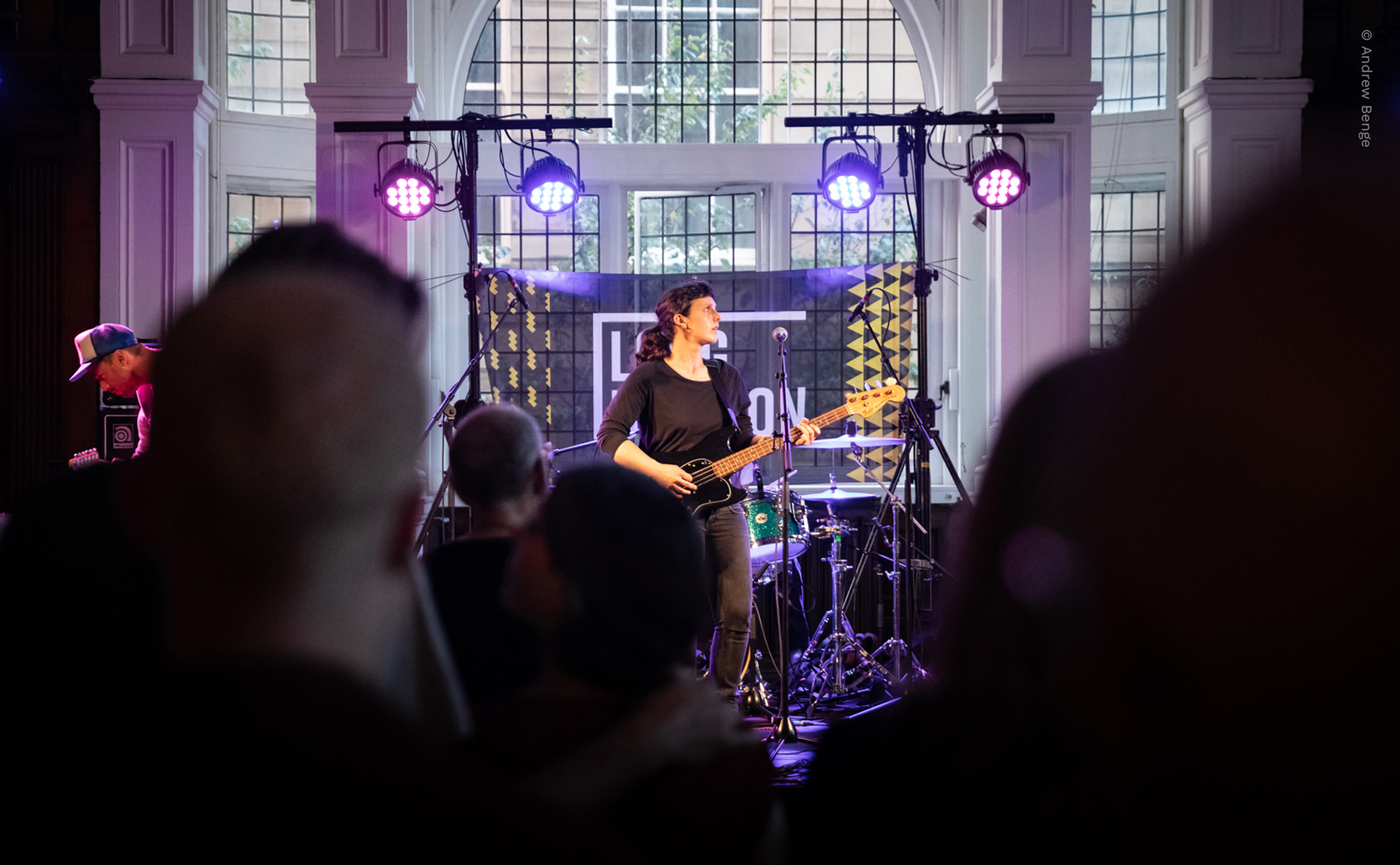
Entering its tenth year, Long Division invited us to create a new brand style for their annual festival, which celebrates all things music, art and culture across multiple city centre venues in Wakefield.
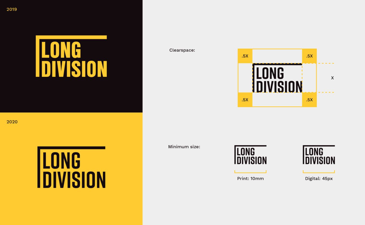
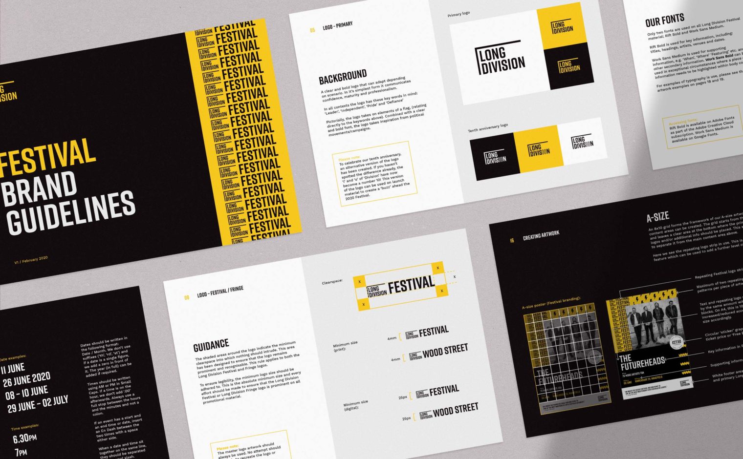
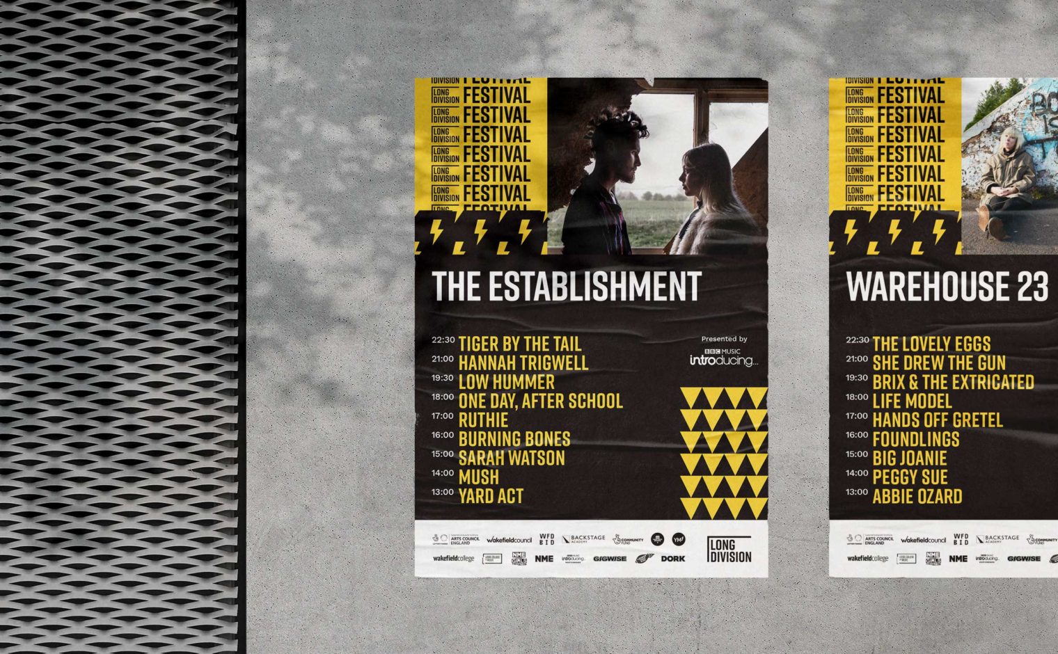
Having built up a loyal following locally, we focussed on evolution rather than revolution, retaining the famous black and yellow colour scheme. The logo was tweaked to have greater legibility, using a leaner typeface with a more consistent line weight. This was accompanied by a set of sub-brand logos for things such as the Festival Fringe and LD:TV online platform.
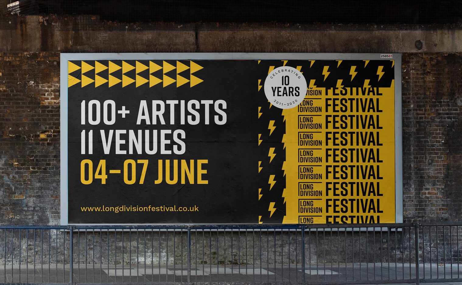
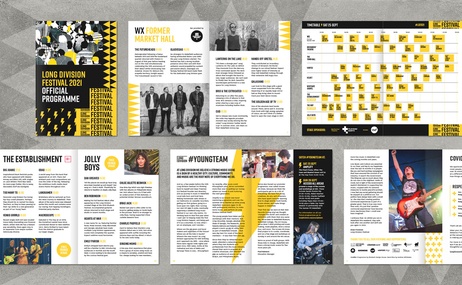
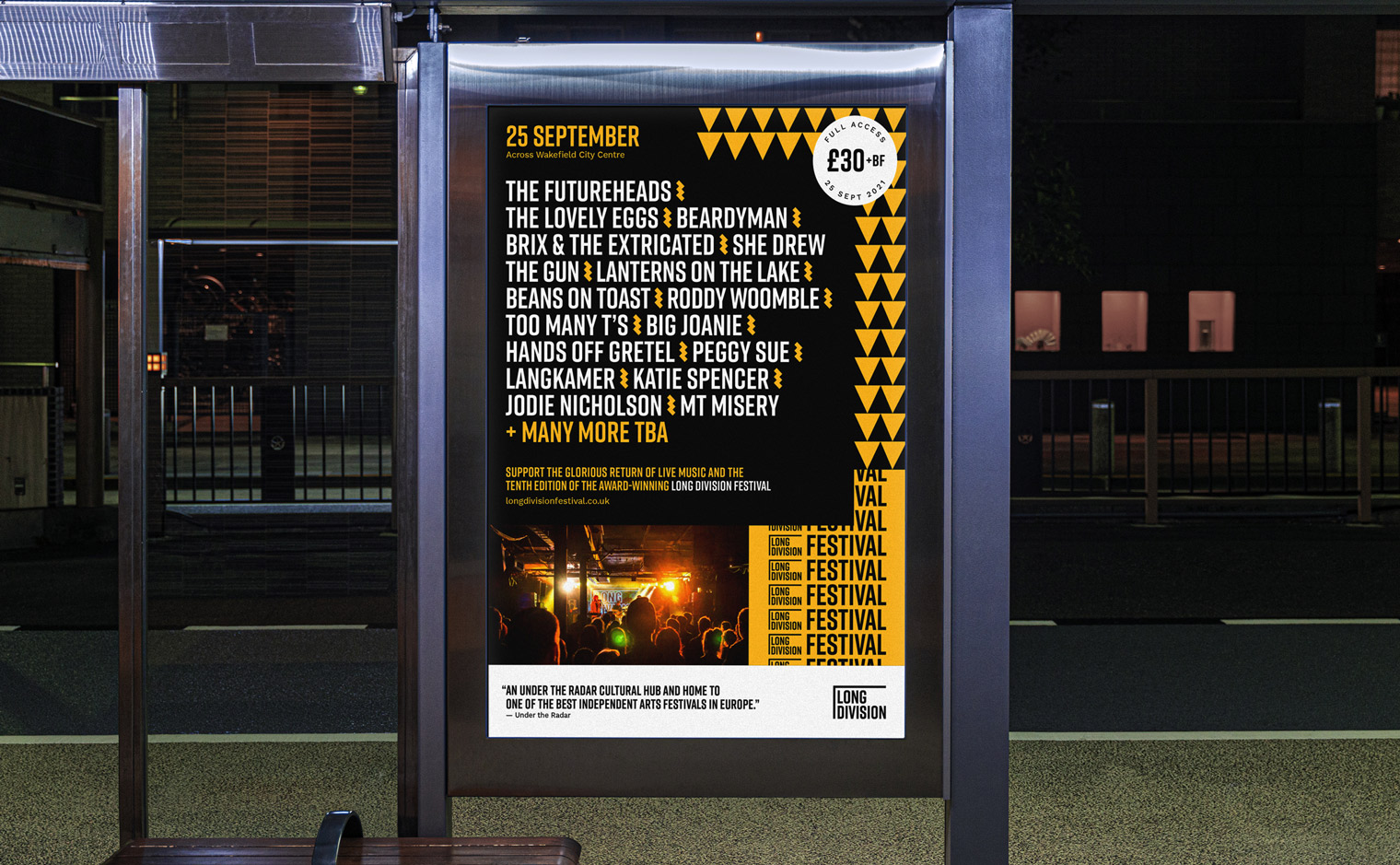
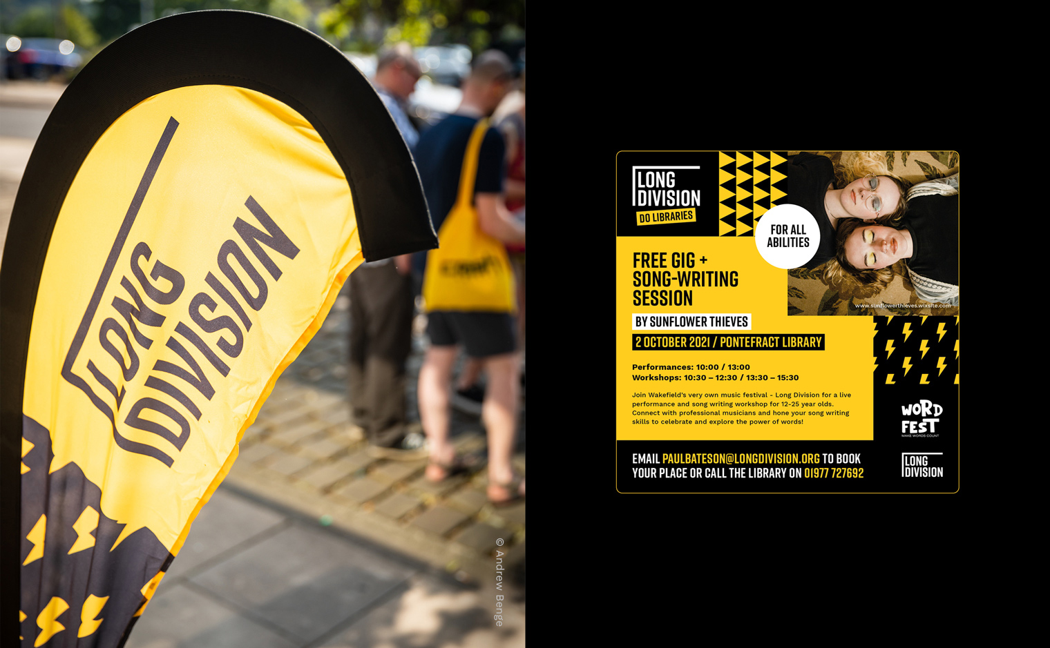
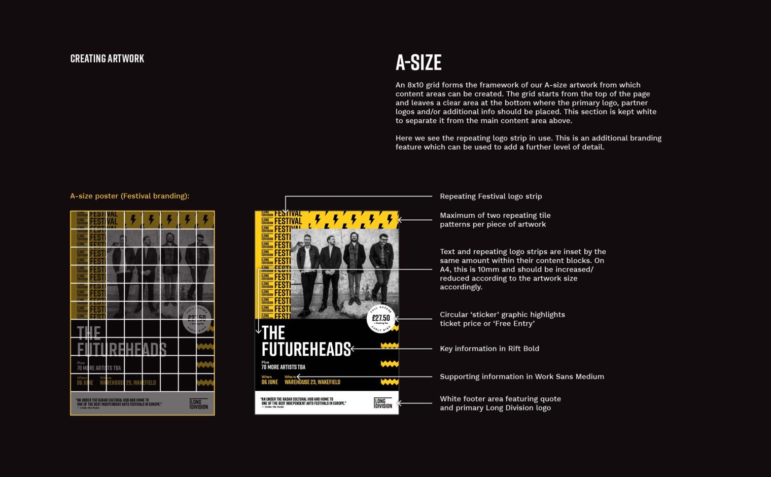
The branding follows a modular design which enables playful compositions. No two designs are the same, however the underlying grid ensures that the look and feel is coherent across all material. The repeating pattern tiles which feature throughout are inspired by creativity, energy and performance; the lightning bolt being carried over from previous iterations of the brand.
