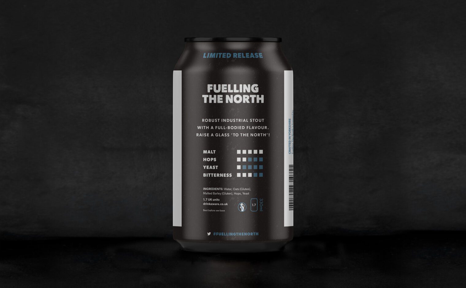
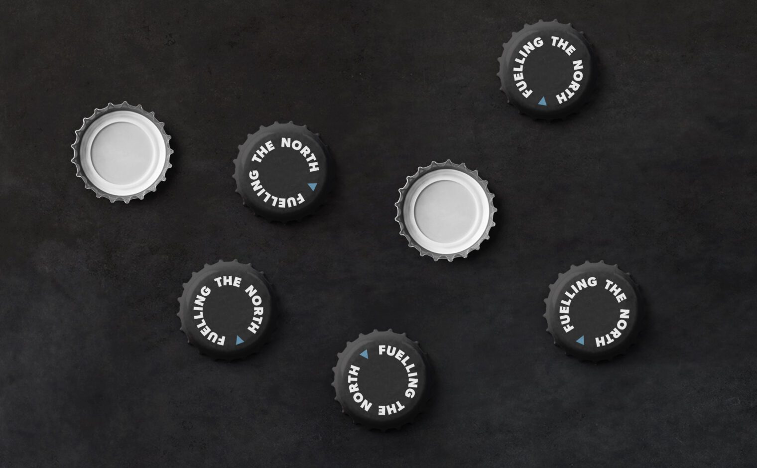
Fuelling The North:
Illustration and packaging design for a new beer brand.
Approach
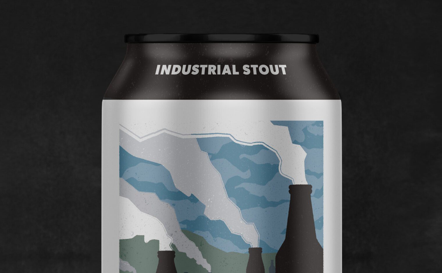
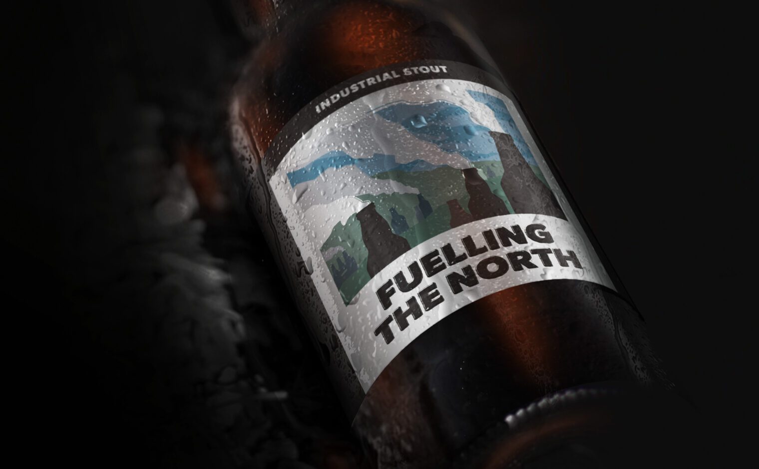
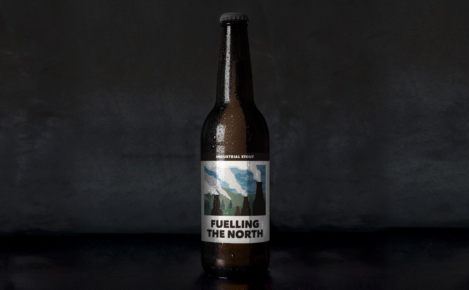
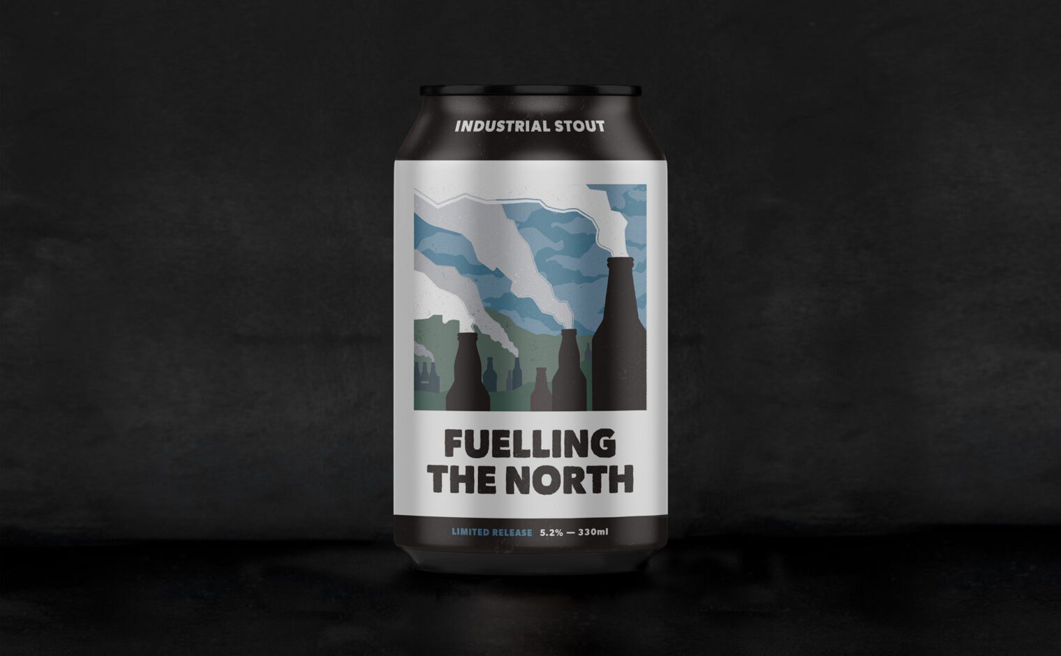
Inspired by the industrial revolution, Fuelling the North is a concept brand for a new beer. The dark colour of the stout is reflected in the can and bottle designs, with a sooty black featuring prominently.
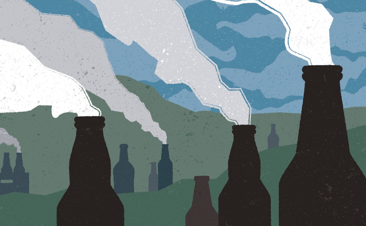
The illustration depicts large beer bottles – resembling towering chimney stacks – rising dramatically from a gloomy northern landscape; the roughened style referencing northern grit. You can almost hear the whistle sounding to mark the end of the working day, with droves of workers flowing to the local ale houses.