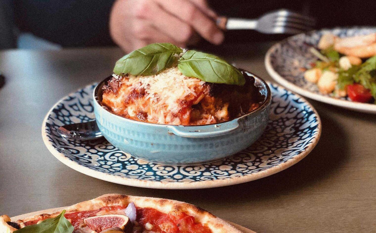
Fino:
Visual identity for a new, authentic Italian dining experience in the centre of Wakefield.
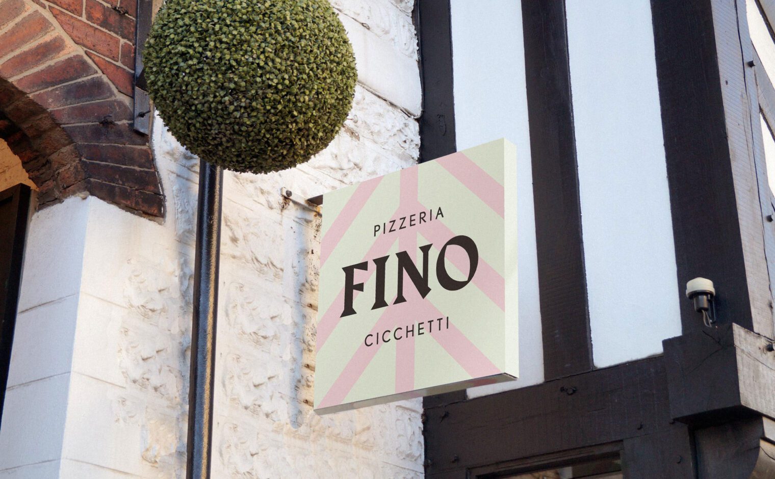
Approach
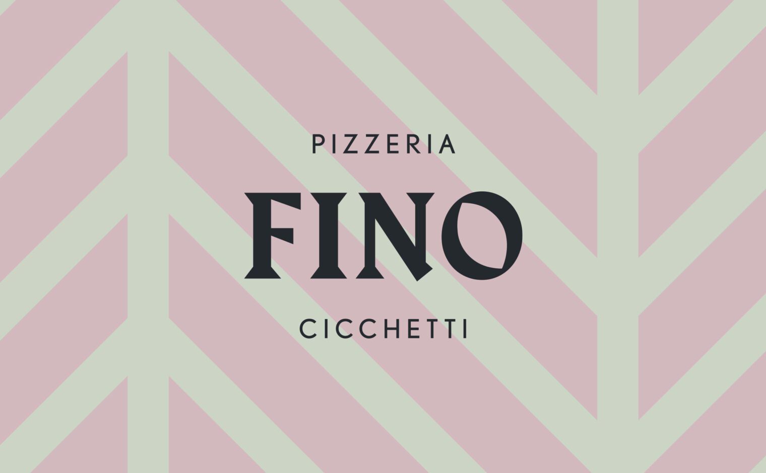
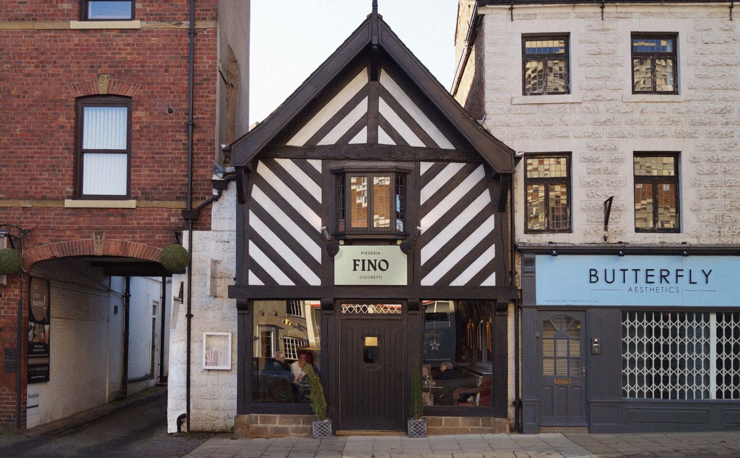
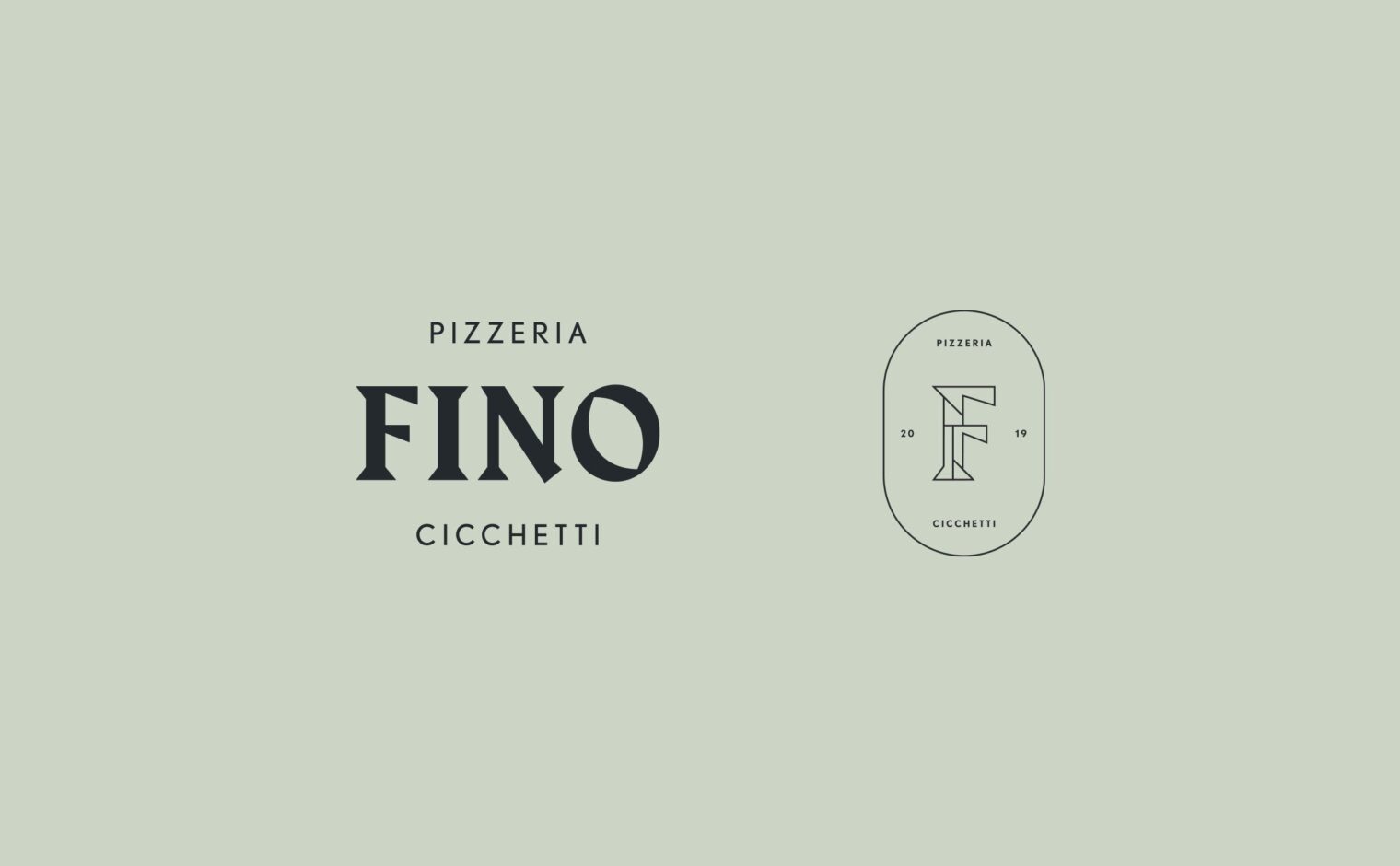
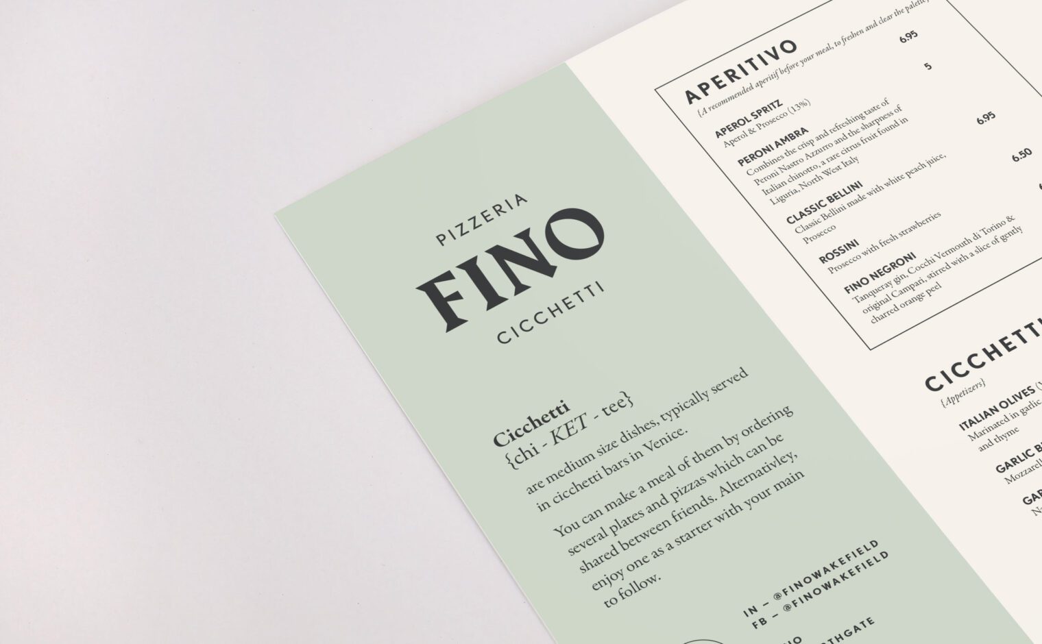
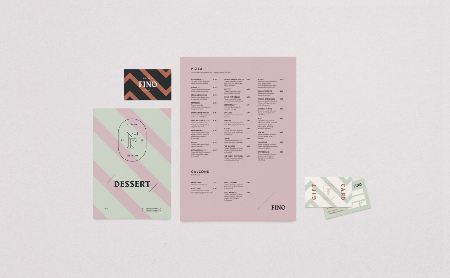
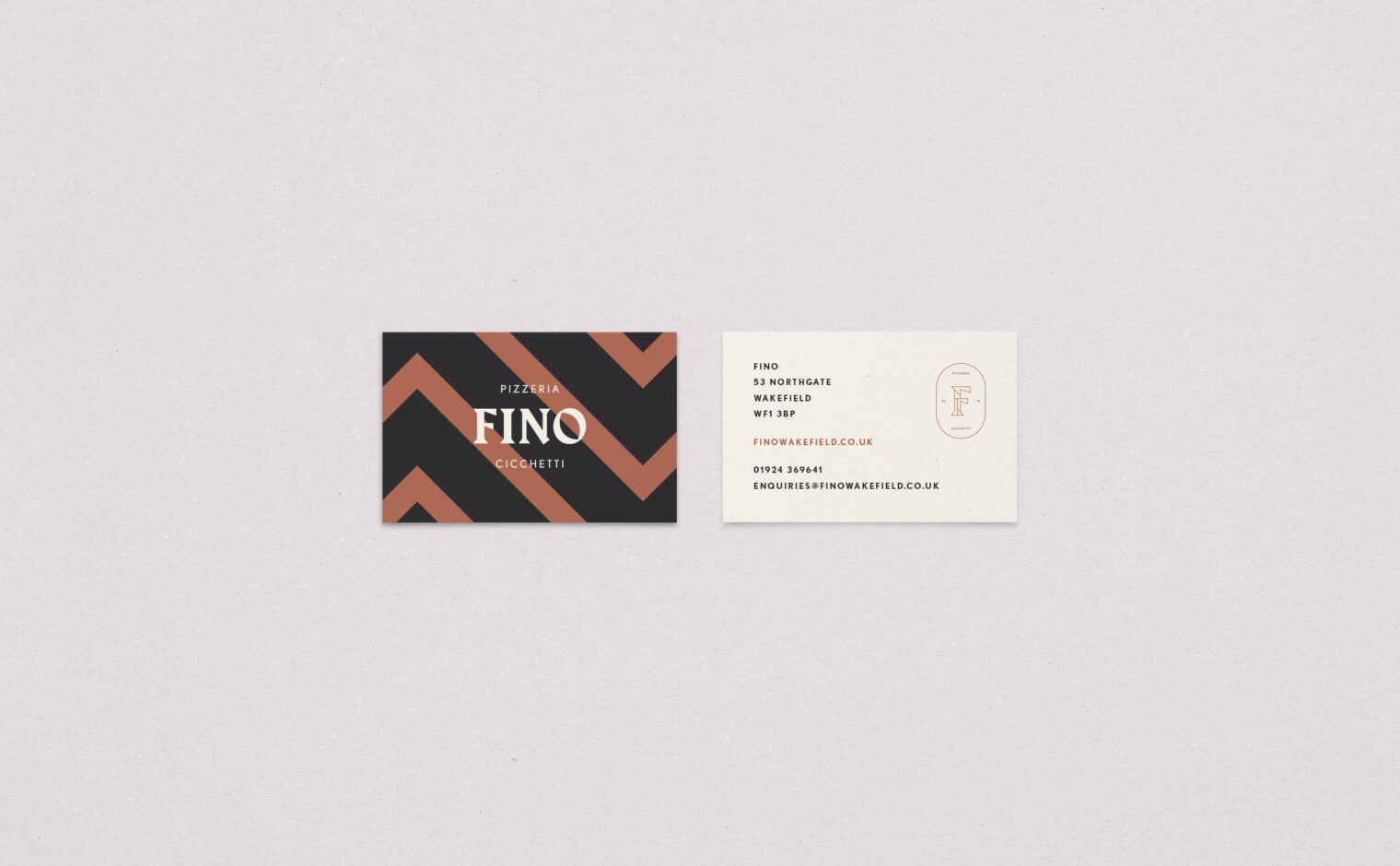
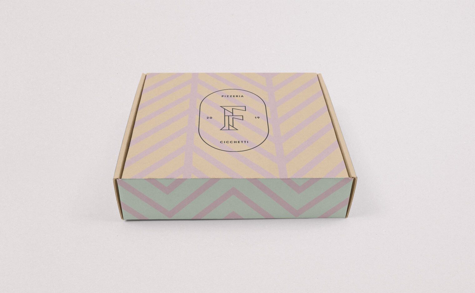
The logo uses a contemporary Wedge Serif typeface that is inspired by a more traditional calligraphic style. This achieves a good balance between modern and classic, to complement the style of the restaurant. The typeface has been specifically chosen to work alongside the beautiful architecture of this 15th century building. The sharp diagonal edges reflect the aesthetic of the timber frame above the entrance.
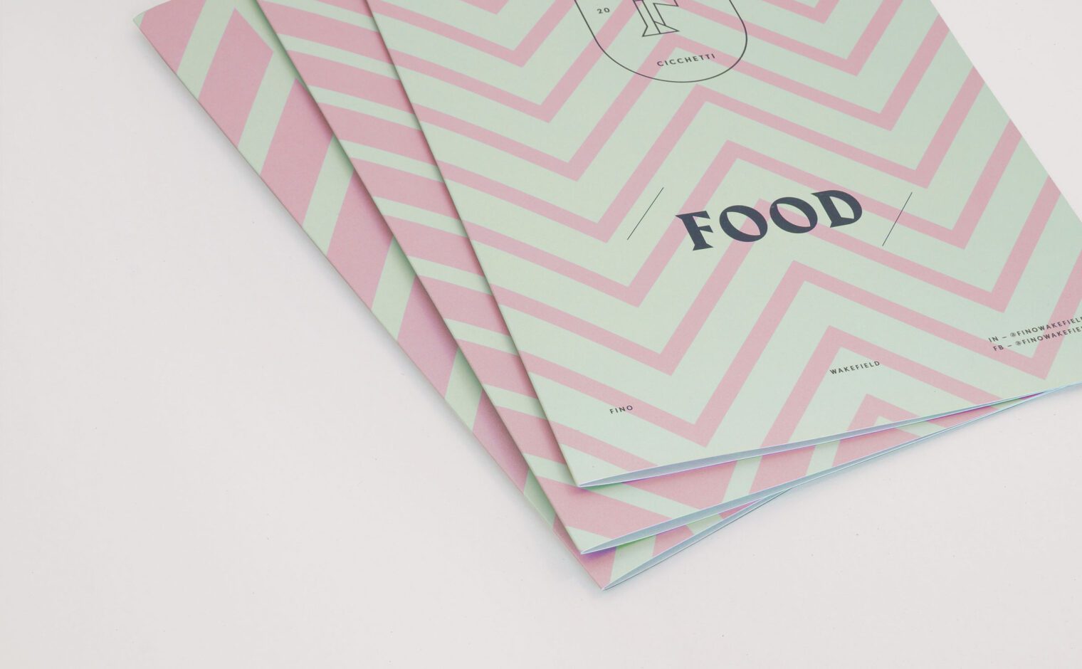
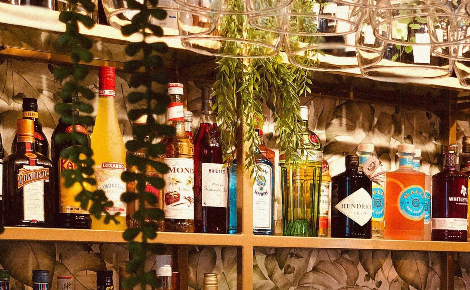
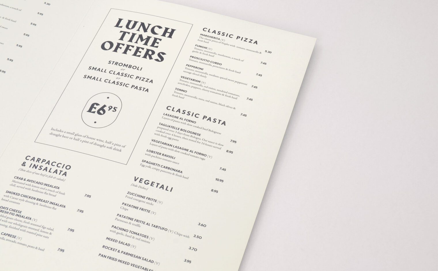
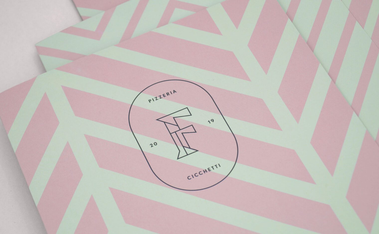
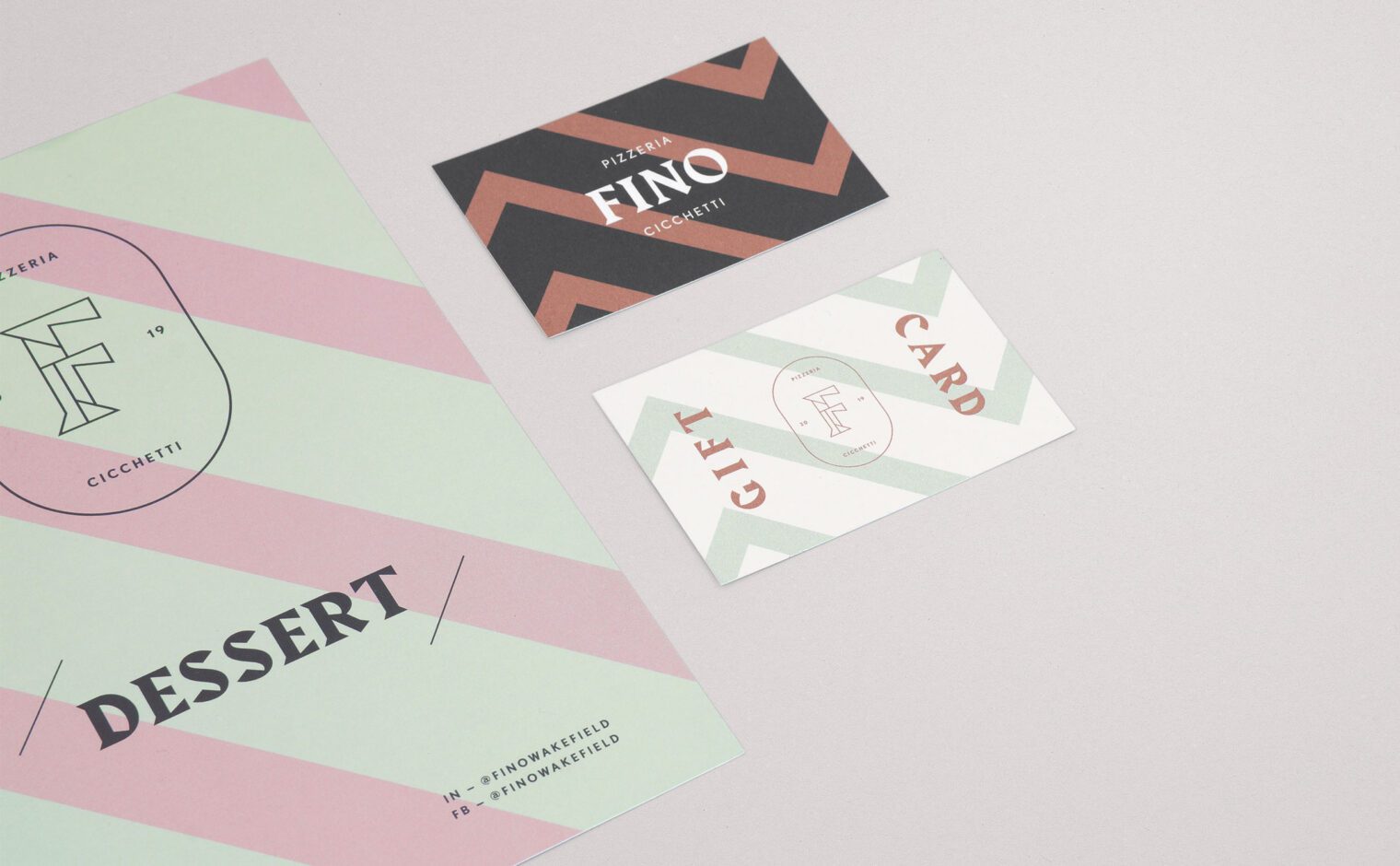
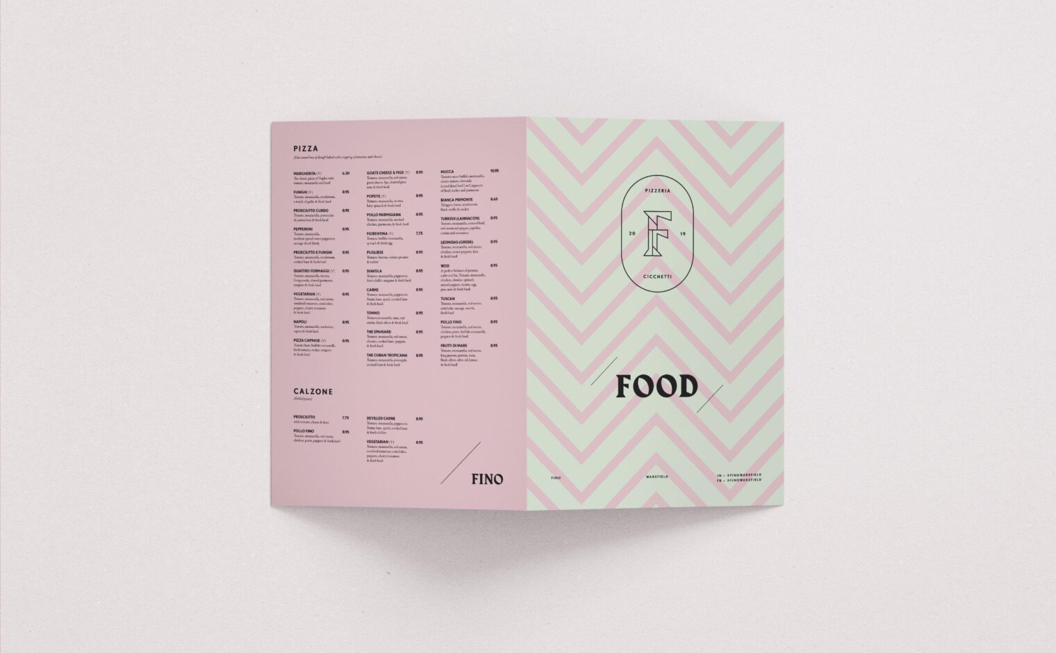
The exterior also provided the inspiration for a range of patterns which are used in modern pastel shades, inspired by historical signage and tiles found on Italian backstreets. In preparation for the restaurant’s launch, we designed exterior signage and printed material including menus, business cards and gift cards.