Experience Wakefield:
Branding for Wakefield, highlighting the arts, heritage and outdoor space in and around this cultural city.
Approach
The Wakefield Cultural Consortium approached us with the task of revamping Experience Wakefield – the main tourist information brand for the city. The previous branding was showing its age and didn’t translate well to digital formats.
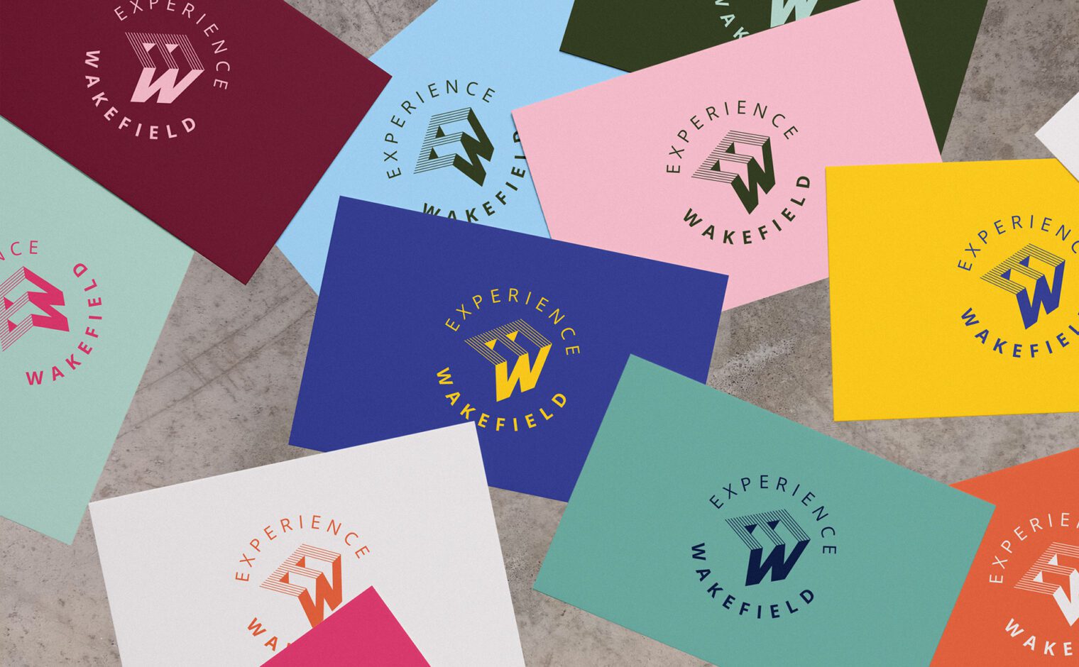
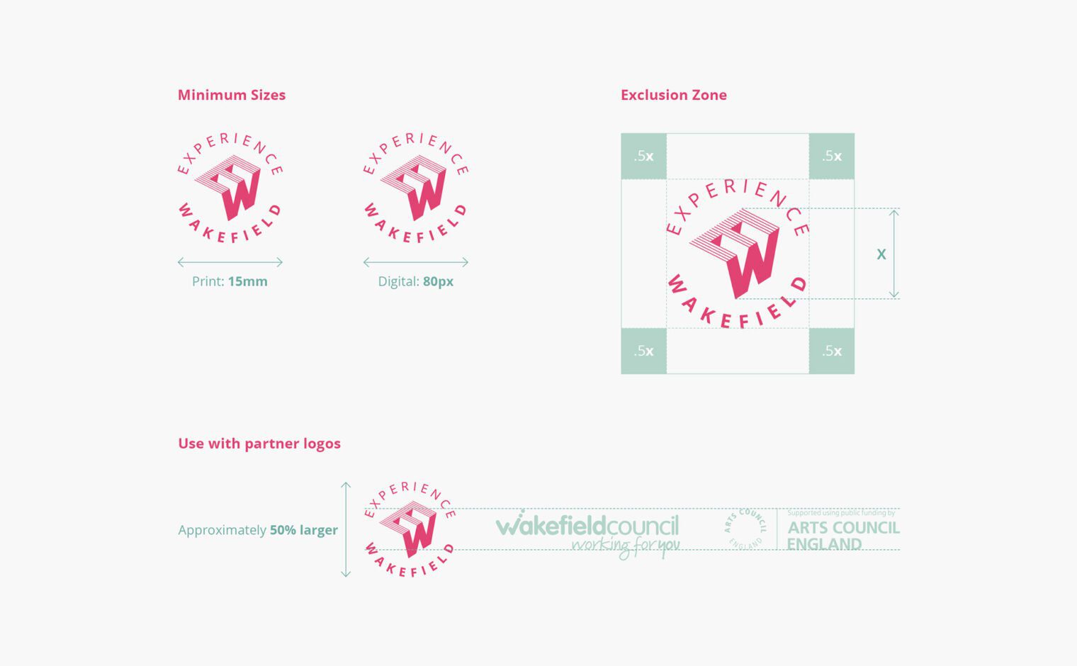
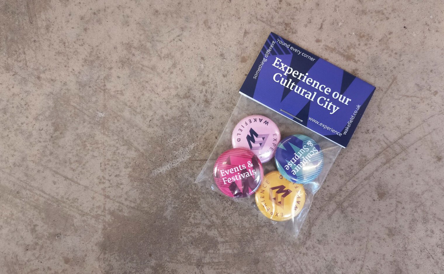
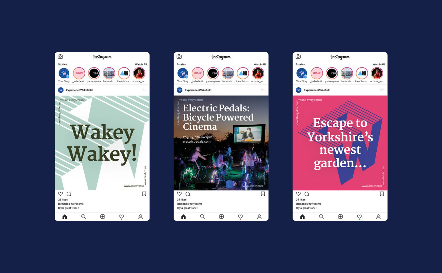
Our approach plays on the city’s association with sculpture. Using the letters E and W, the logo takes a sculptural aesthetic with emphasis on the letter W. The linework references the arts whilst the shaded 3D form hints at an outdoor environment and industrial heritage of the region. The wording encases the main symbol to create a circular stamp, which can be used as a ‘seal of approval’, endorsing events and venues across the district.
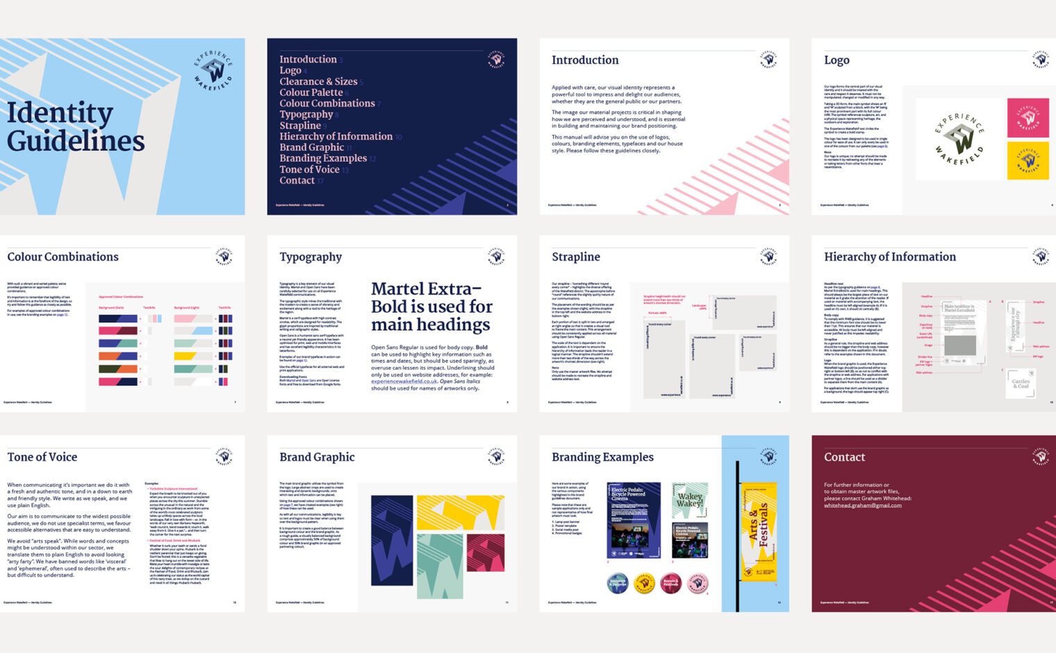
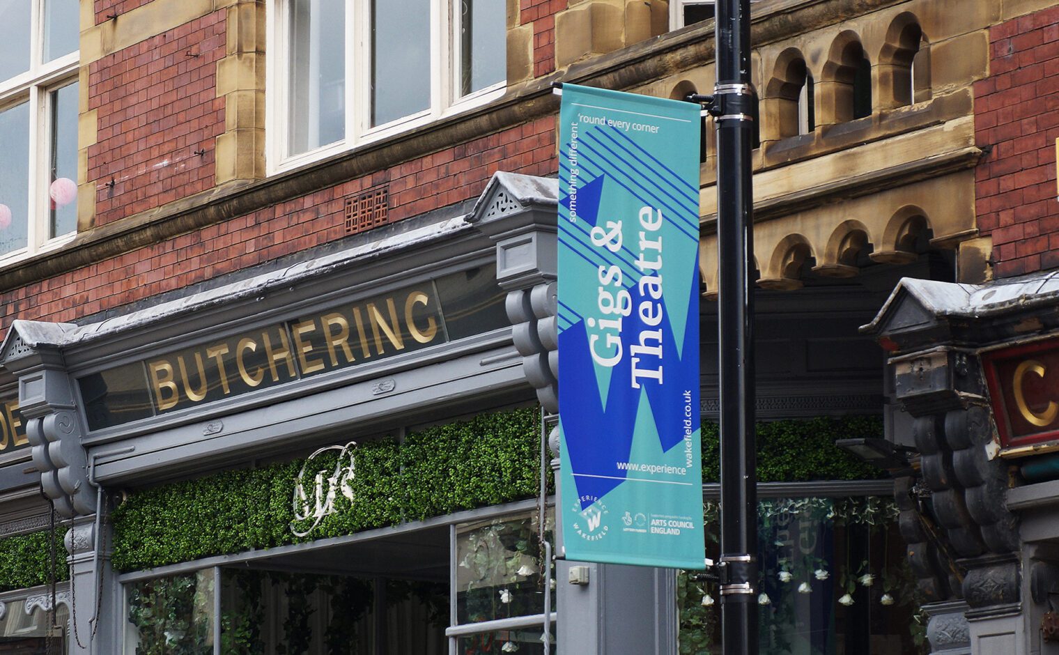
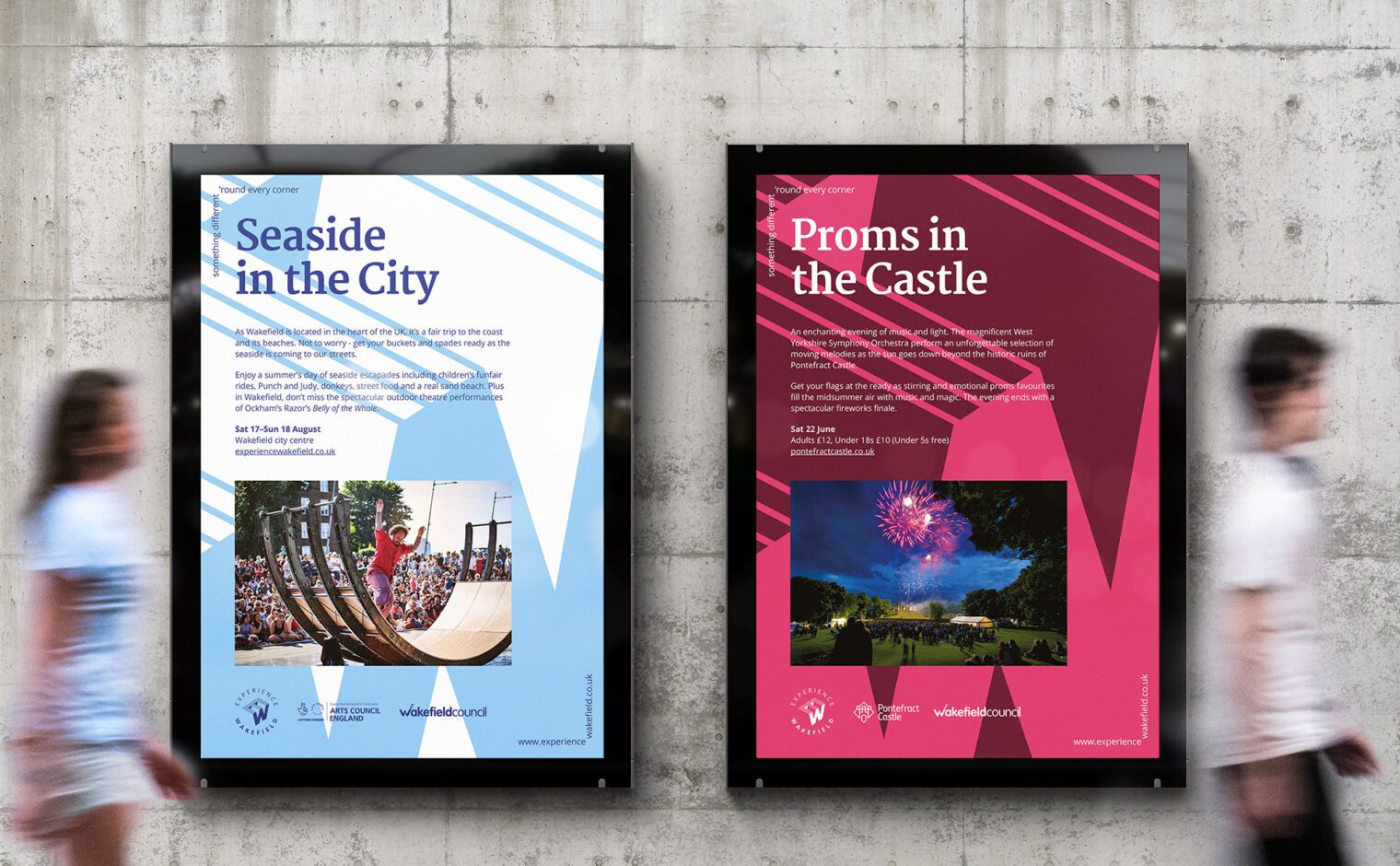
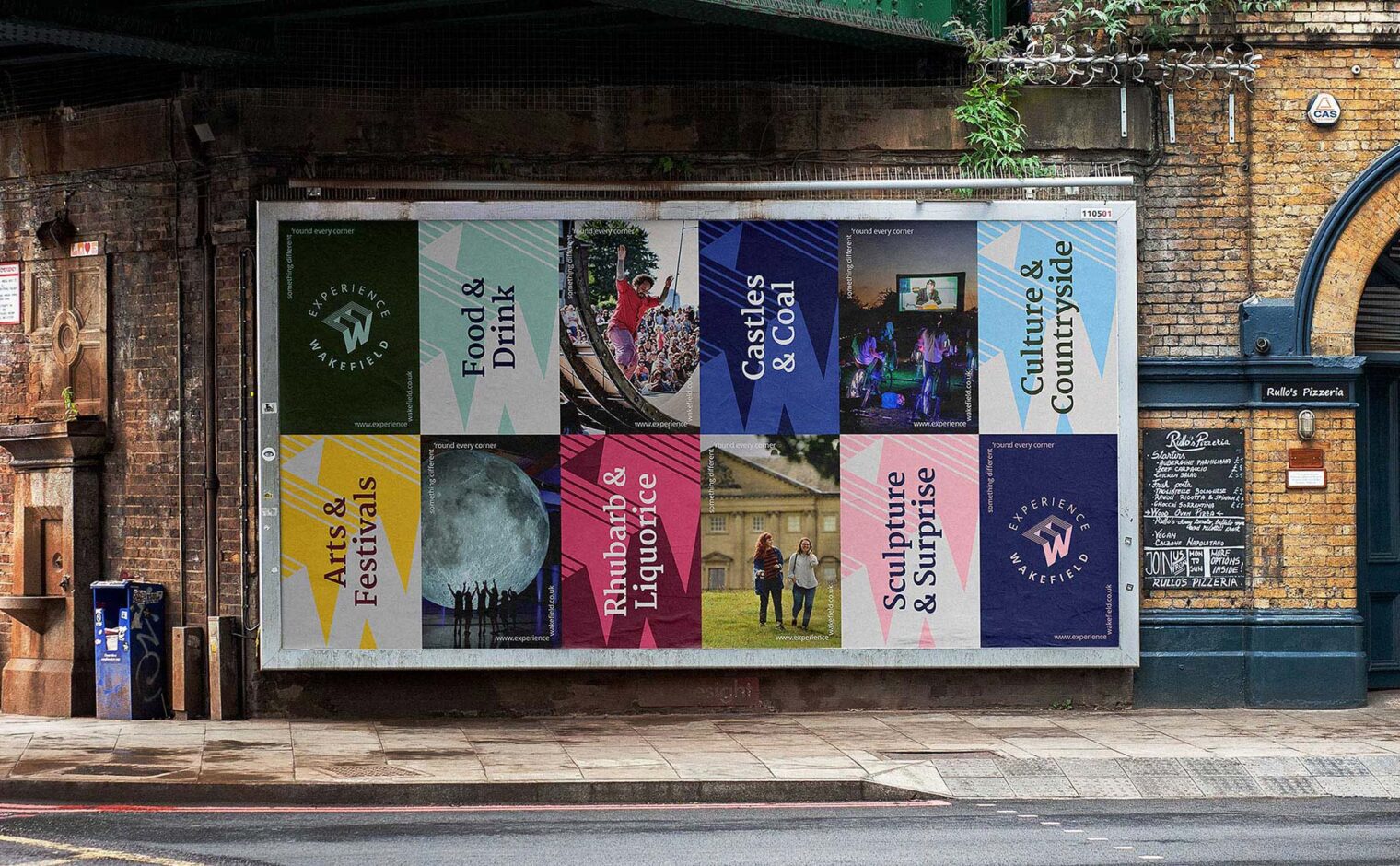
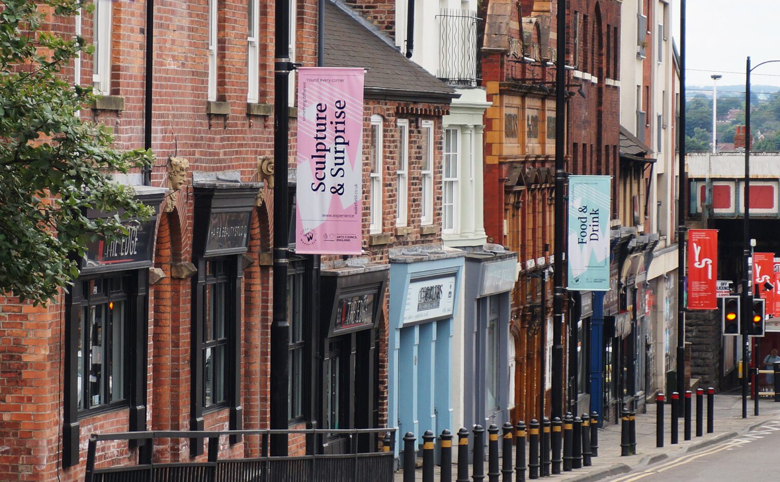
The branding takes a bold graphic style utilising large abstract crops of the main logo symbol and is combined with a large colour palette which is playfully mixed up across marketing material. This also feeds into the new strapline; “something different ’round every corner”, which highlights the diverse offer the area has, and that surprise is never far away.
