Pinfold Farm Shop:
Brand identity for a Yorkshire-based farm shop and café.
Approach
The owners of a North Yorkshire farm approached us to create a brand for their new farm shop which recently had planning permission granted.
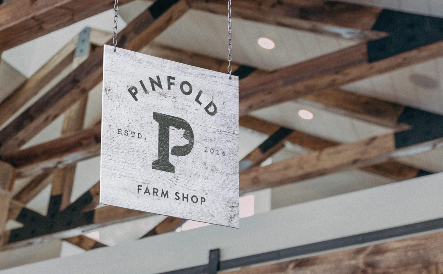
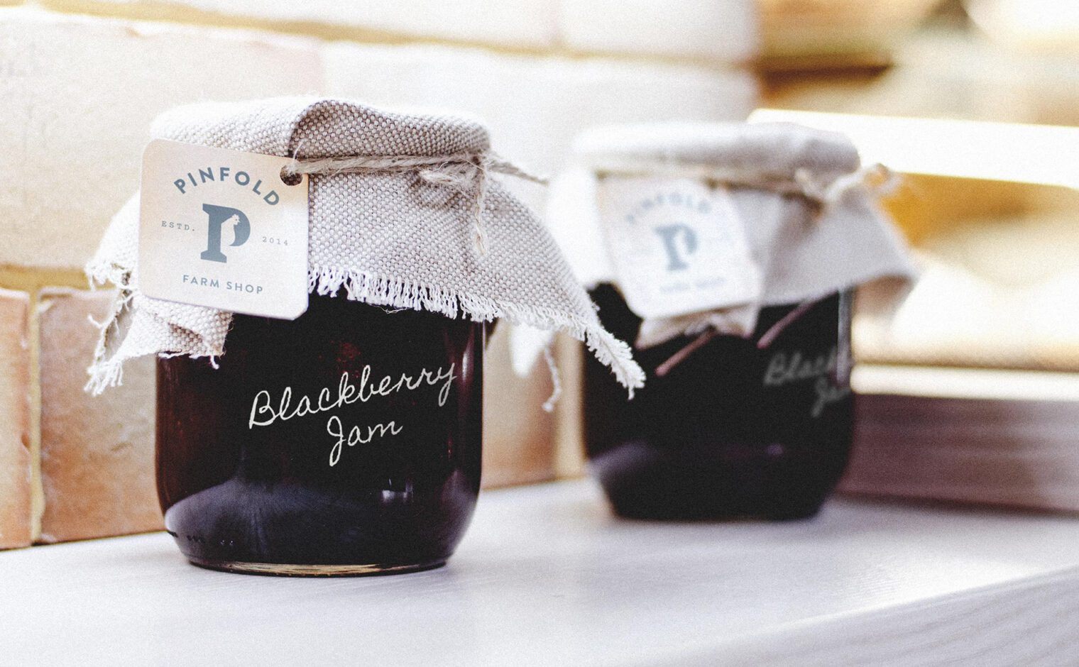
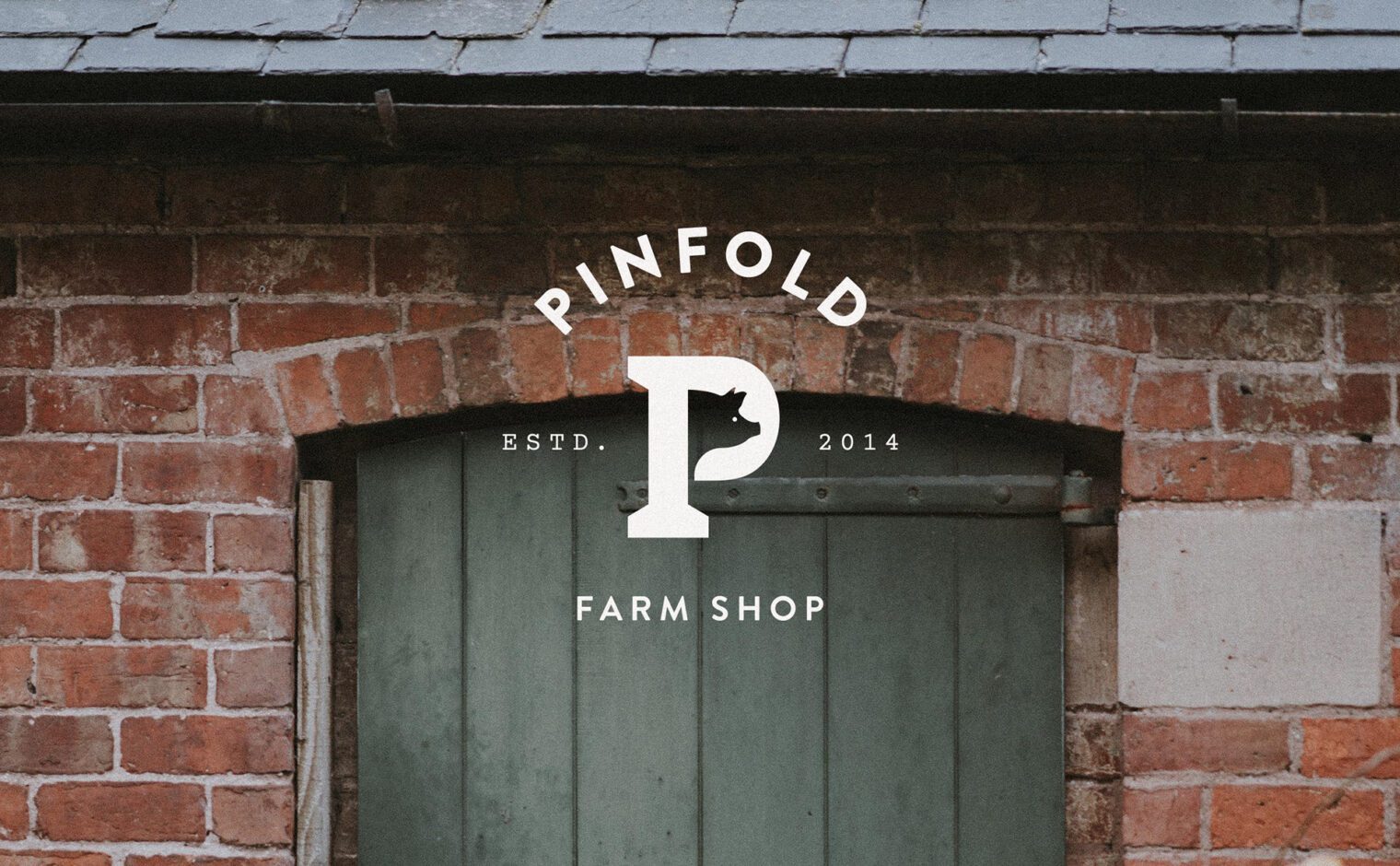
The concept is based around the name of the farm; ‘Pinfold’. An old Saxon word meaning ‘a pound for stray animals’, these were places where stray animals could be kept until reunited with their owners. Using this as a starting point we explored visuals where animals were housed within shapes or letterforms. This eventually led to various animal heads being framed by the letter ‘P’ to give an instantly recognisable icon.
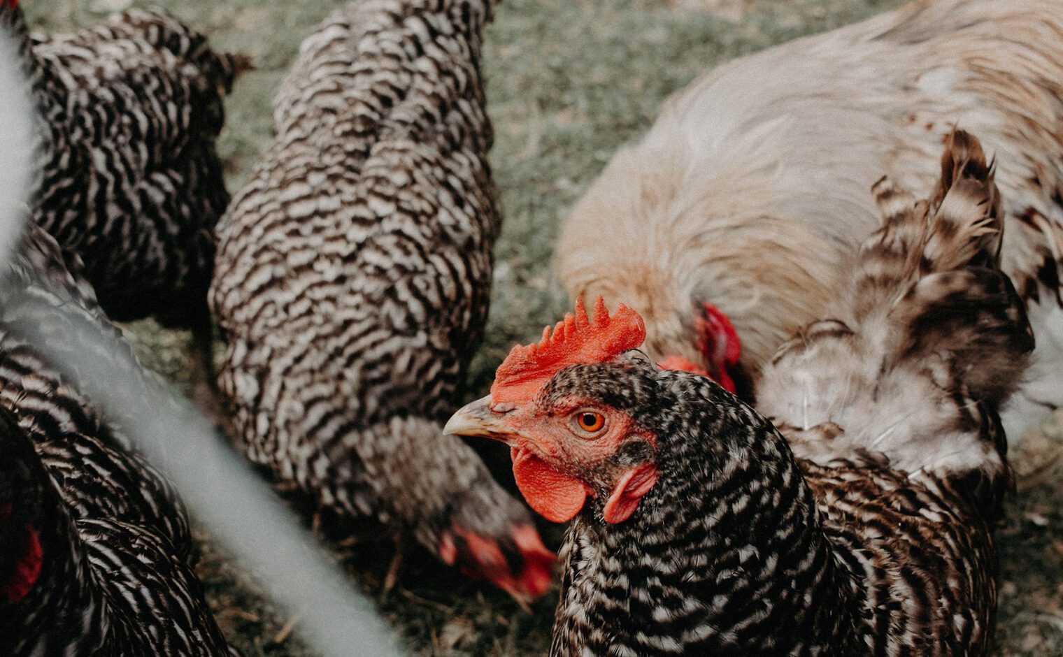
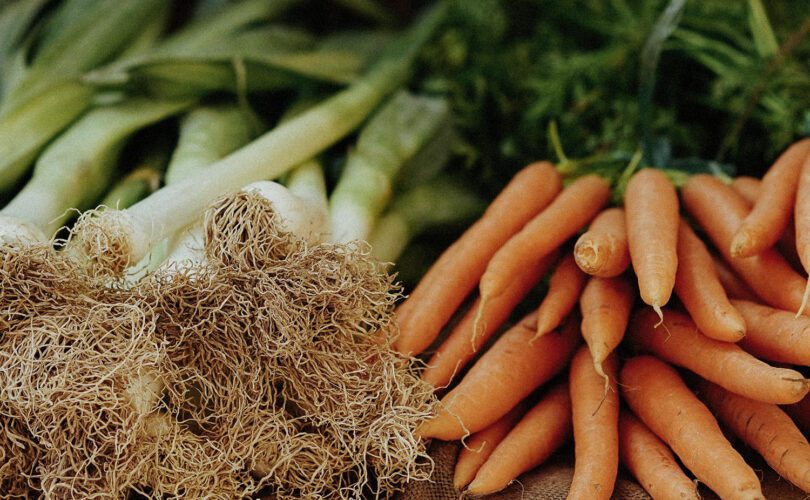
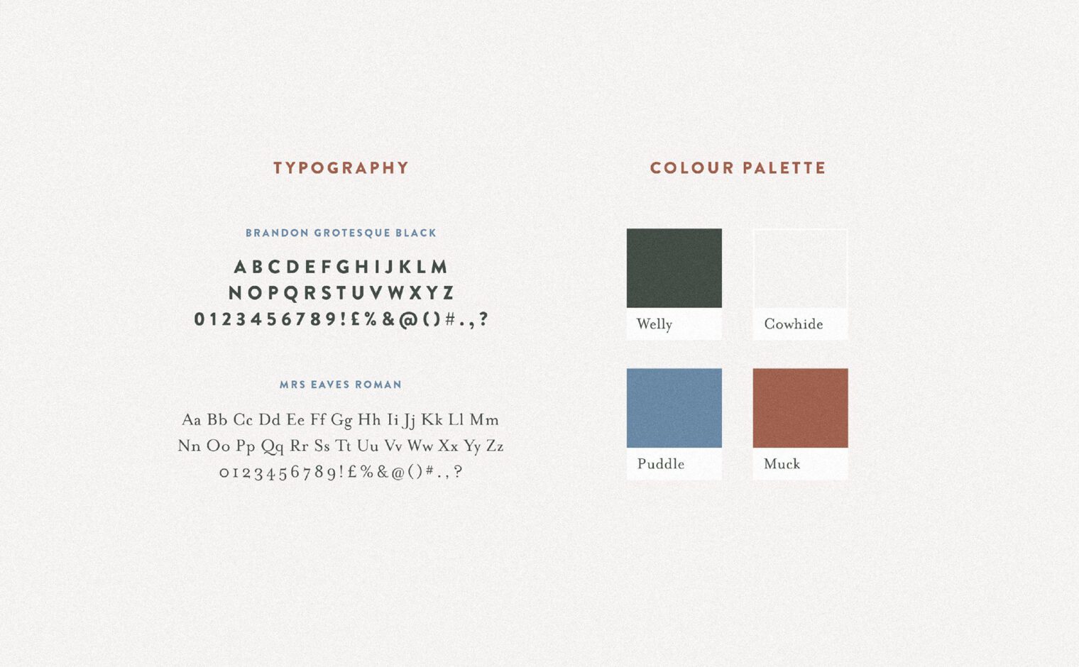
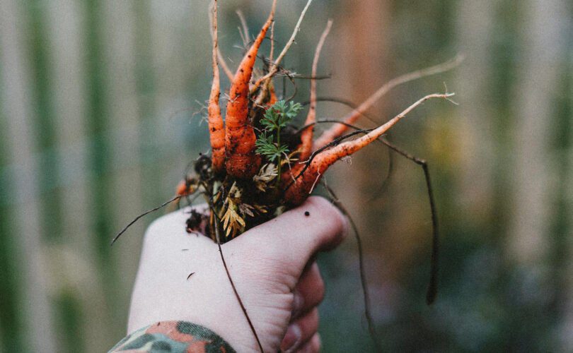
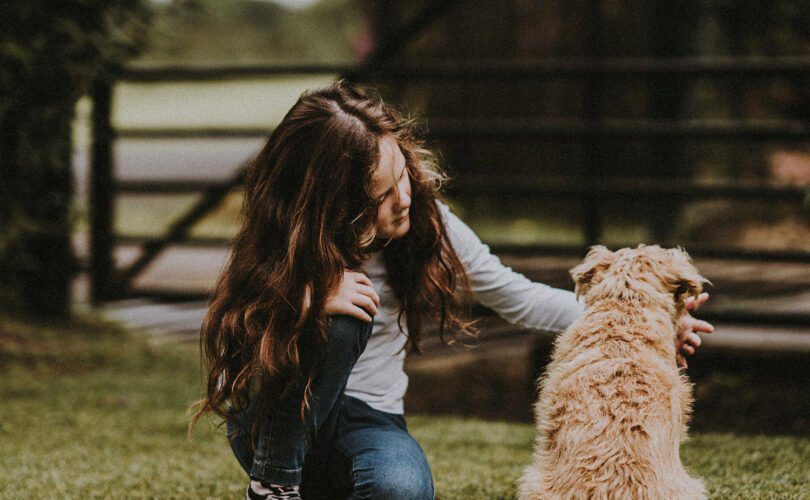
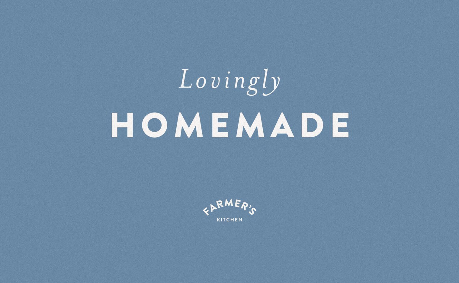
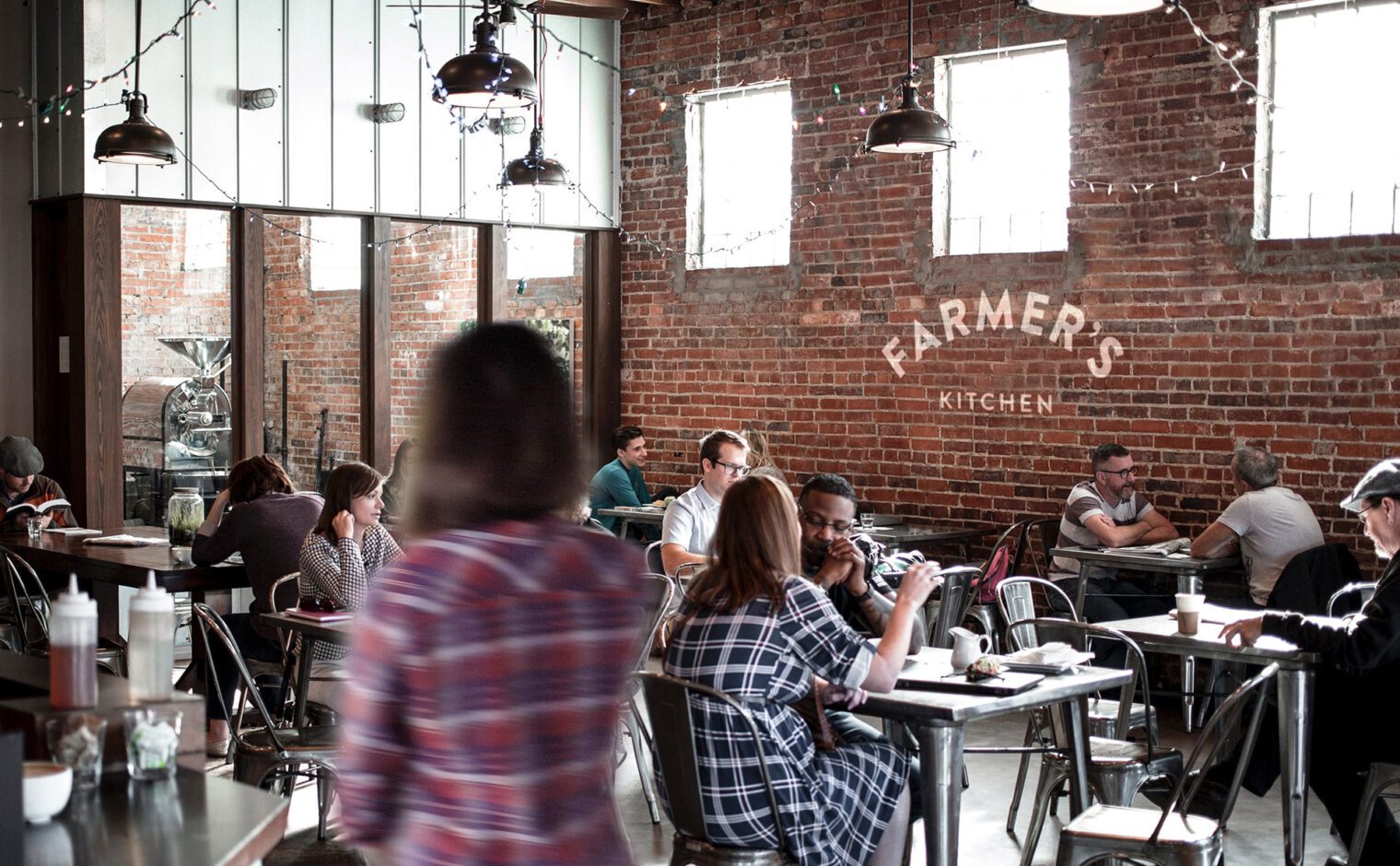
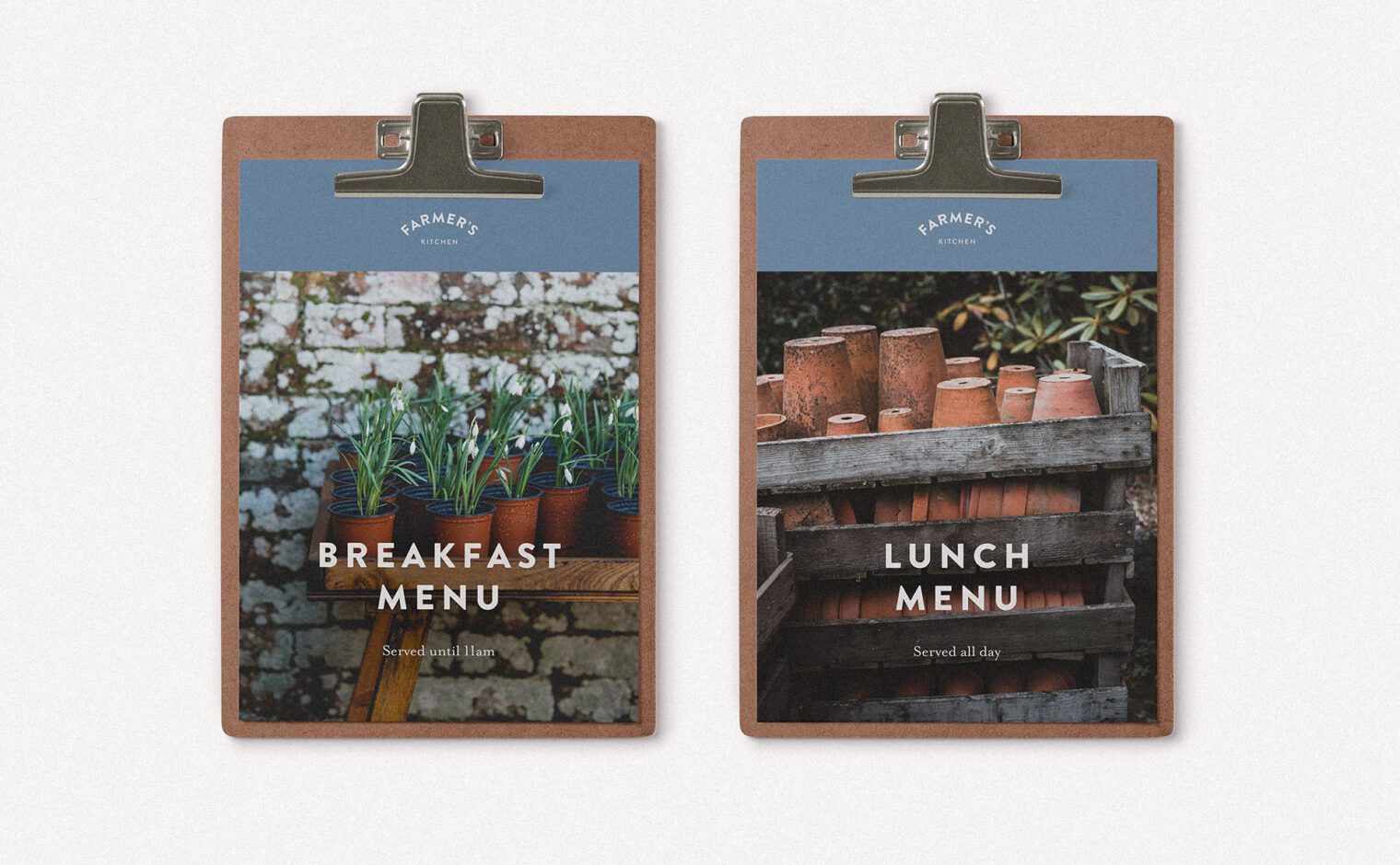
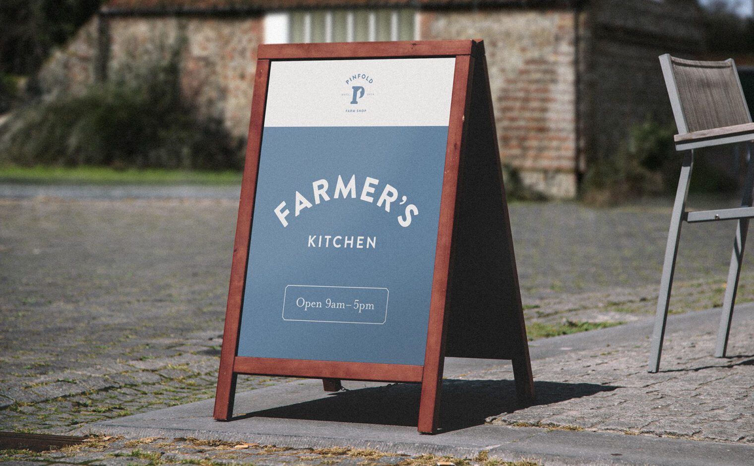
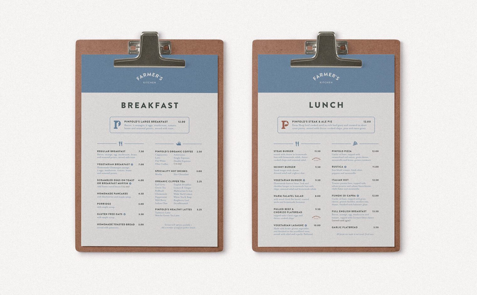
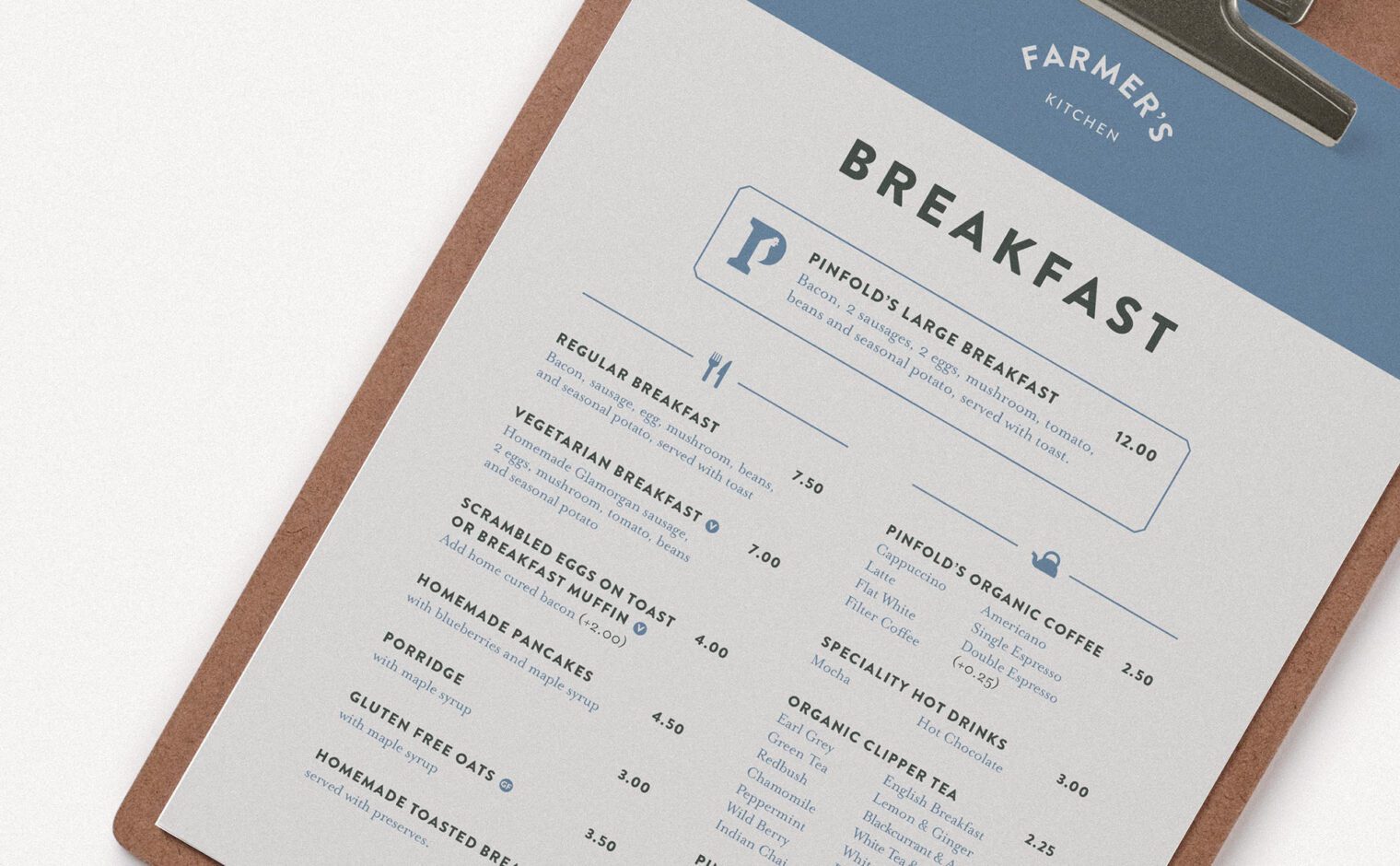
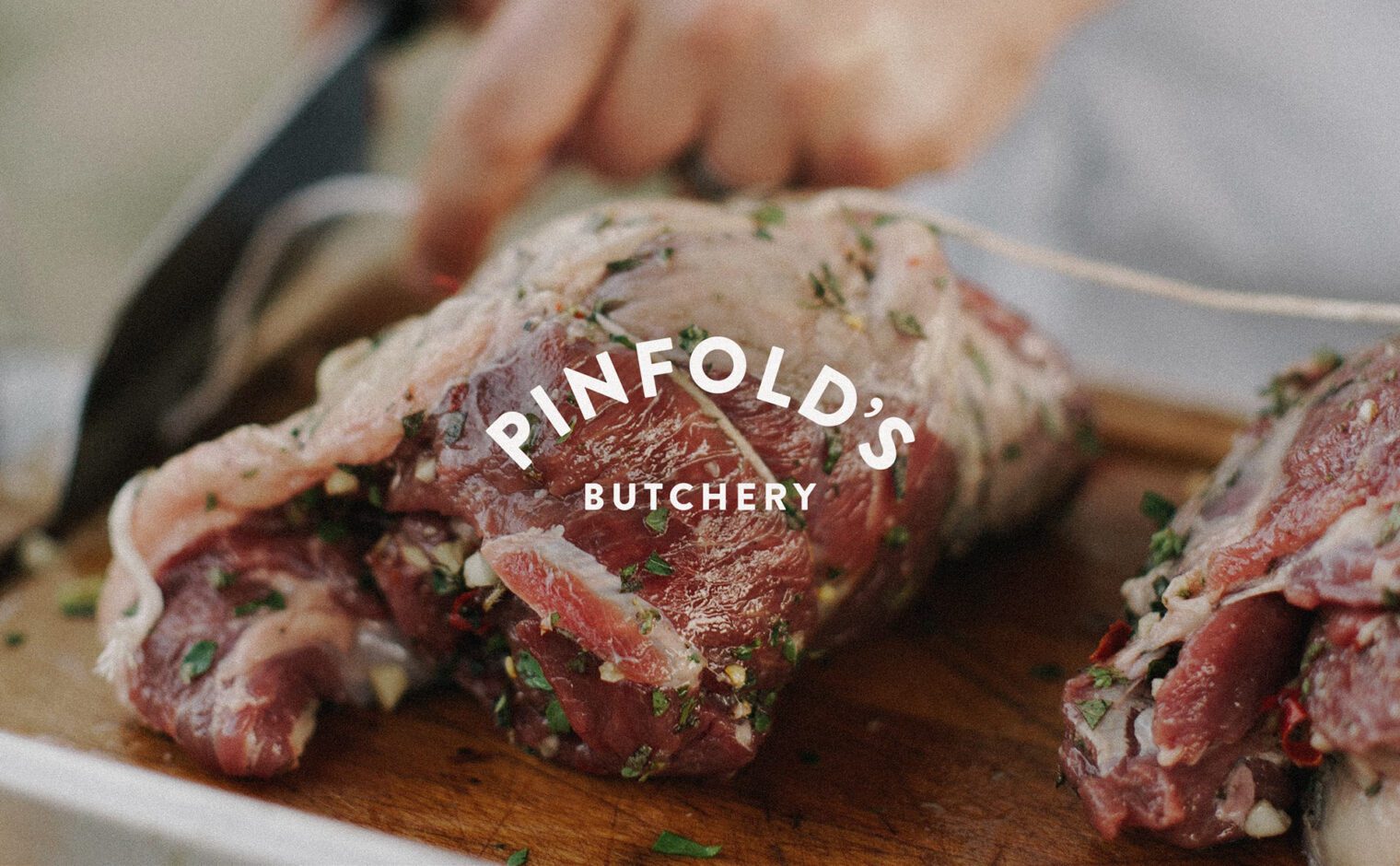
The colour palette takes reference from the location, with a rich green shade forming the primary colour. Further colours are used to highlight the sub-brands within the farm shop. A bright blue is used for the Farmer’s Kitchen Café whereas a traditional brown is used for the Butchery. Together these form an earthy and natural collection that is reinforced by the wholesome photographic style, which showcases homegrown produce and quirky details around the farm.
The mixture of modern typography and the nod to tradition through colours and photography help create an offering which feels organic and inviting. This combined with the use of natural materials such as wood help set the tone throughout and tie the branding into the environment.

